HomeSecure mobile app
I saw an opportunity to improve upon a home security app I use every day
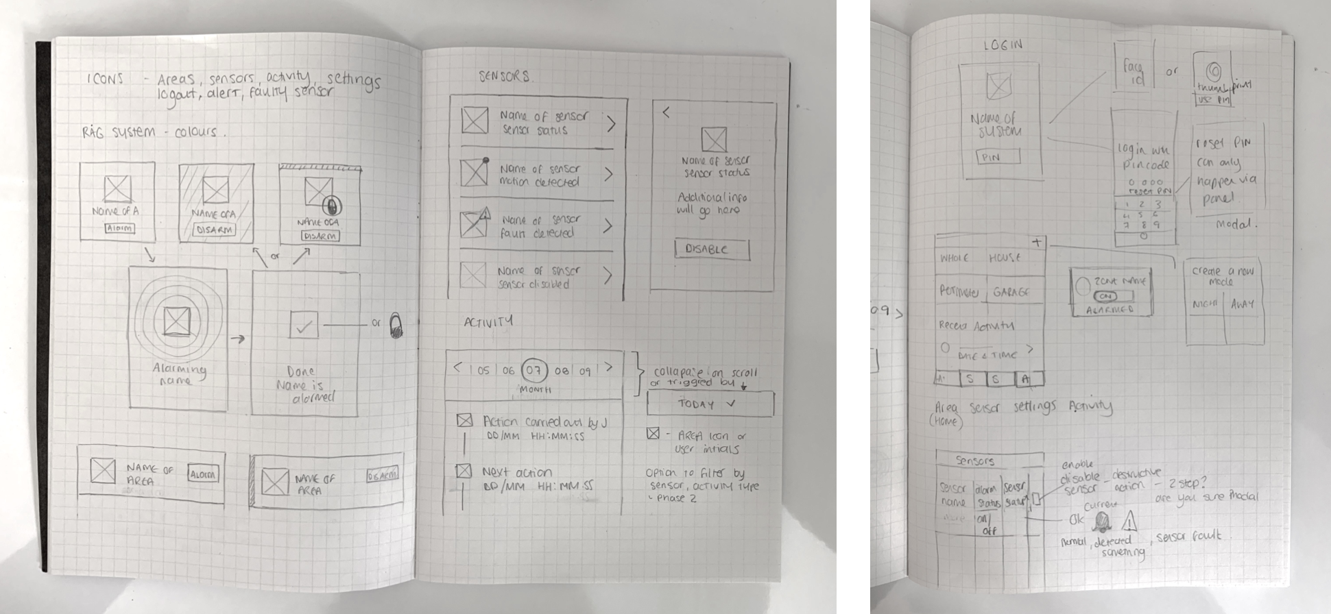
Problem: The design appears dated with incorrect usage of common UI patterns. Language and labeling are not user-friendly resulting in poor way-finding.
Solution: Uplift the UI and create a consistent visual language. Organise content, make better use of navigation, strip back jargon, and use simpler terms and language to make way-finding intuitive.
Outcome: Improved user experience and UI uplift. One core navigation tab bar is labelled for accessibility. Destructive actions and additional information are separated from core content to make everyday task completion quick and easy.