Scaling a Cross-Platform Design System Across 5 Product Squads
PRODUCT SQUADS
300+
COMPONENTS
5
DESIGNERS
3
PLATFORMS
12
The problem wasn’t building components - it was scaling adoption
📣
Increased demand for new components to support product launches
😶🌫
Ambiguity in roadmap alignment between the system team and the product squads
🧩
Risk of fragmentation as squads moved quickly
📐
Need to scale without the central team becoming a bottleneck
🌪️
Historical friction between design and engineering
MY ROLE • MY CRAFT
From product UI to system-ready components
Within a central design systems team, I:
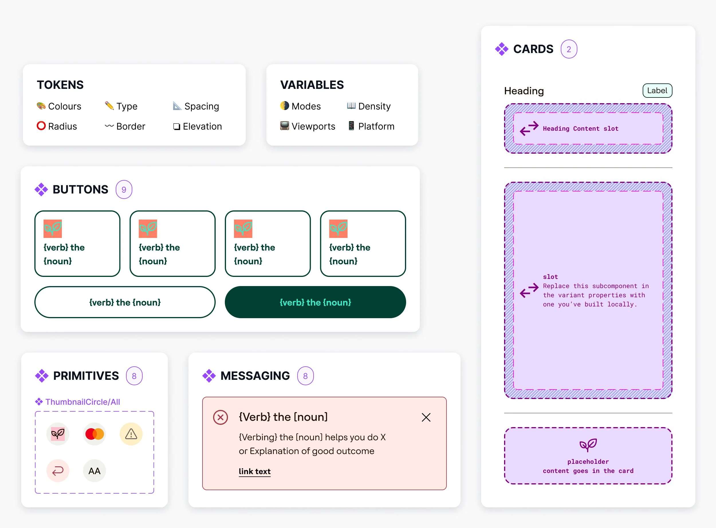
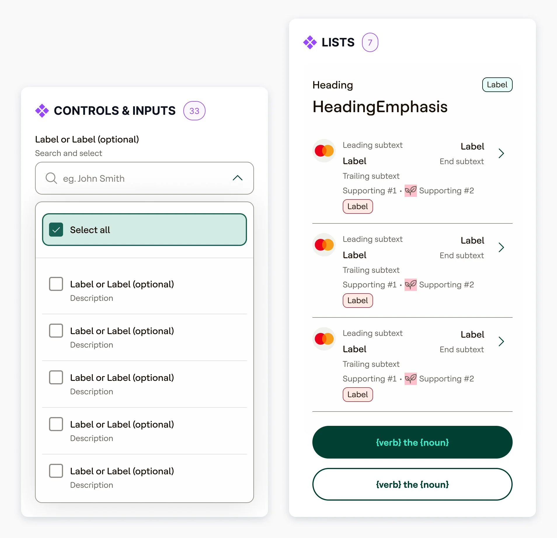
Created reusable components from scratch based on defined use cases and acceptance criteria
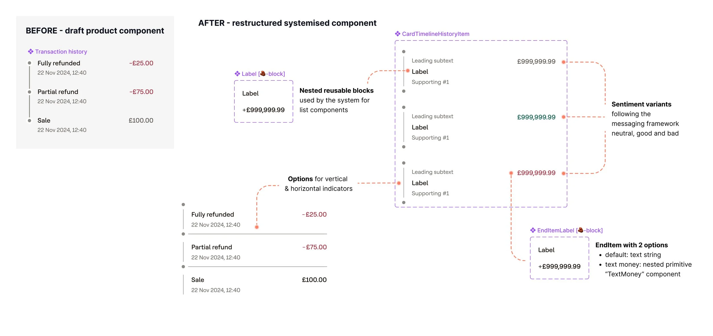
Took draft UI from product squads and restructured it into reusable, token-aligned components that could scale across Web, iOS and Android.
Worked across Web, iOS and Android to ensure parity in behaviour and documentation
Participated in architecture and refinement sessions with engineers
Conducted QA reviews of coded components and demo apps
Helped define naming conventions and documentation standards
Supported quarterly planning and strategic pivots within the system team
Beyond craft, I focused heavily on enablement and operational maturity.
Decentralising contribution without losing integrity
TIERED CONTRIBUTION MODEL • CO-DEFINED & OPERATIONALISED
As demand increased, we needed to decentralise contribution without compromising system integrity.
I co-defined and operationalised a tiered contribution model:
TIER 01
Core
Stable, production-ready components governed by the system team. Reusable across all platforms, fully documented and token-aligned.
TIER 02
Lab
Components gaining traction across squads. Hosted in Pando to increase visibility and benefit from system-wide improvements over time.
TIER 03
Local
Squad-level components for experimental or context-specific UI. Not yet ready for systemisation.
DESIGN OPS • ENABLEMENT
Restructuring the system hub for real people
Adoption requires clarity.
I restructured the design system hub in Notion to align with key personas (designers, engineers, contributors), reflecting the maturity of a growing system rather than presenting it as fully established. I:
Redesigned the information architecture
Rewrote onboarding content
Created component creation checklists
Built Figma playground sessions to guide best practice
Ran workshops focused on scalable component thinking
Feedback highlighted improved clarity, approachability and stronger alignment with engineering.
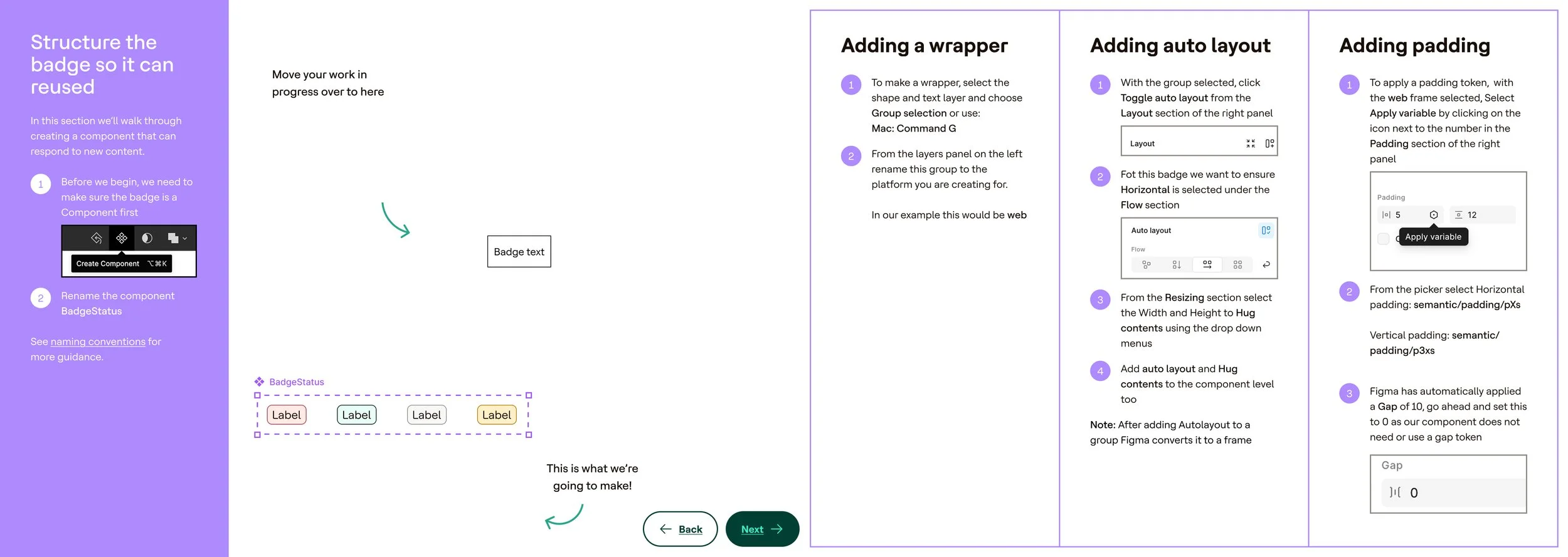
Figma Playground: “Let's make a notification badge”Pando Design System Hub - sitemap BEFOREPando Design System Hub - sitemap AFTERWEB • IOS • ANDROID
Same behaviour. Every platform.
Dropdown anchors below the trigger, showing a list of options inline. Closes on outside click or Esc. Keyboard navigable.
Native iOS Sheet slides up and overlays the content, showing a list of radio cards with a close dismiss icon.
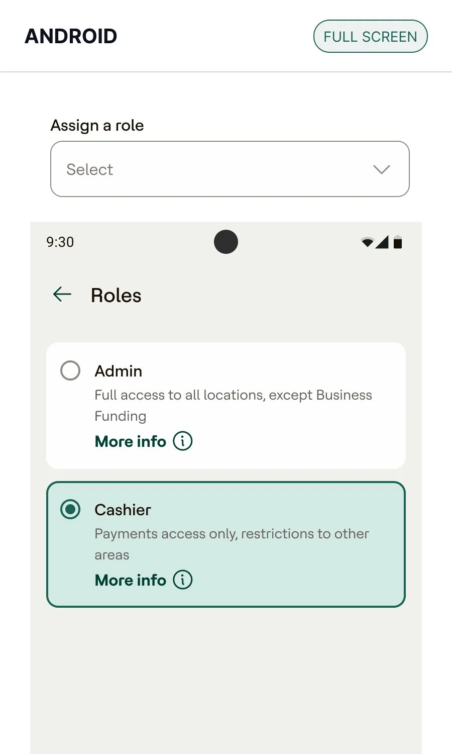
Full screen modal, with a back-button dismiss, showing a list of radio cards with a back to previous screen icon.
ACCESSIBILITY • WCAG • EAA
A foundational constraint, not an afterthought
While accessibility strategy was led by our subject matter expert, I embedded accessibility directly into component creation and documentation.
This included:
Baking WCAG-aligned requirements into component behaviour
Documenting interaction states and edge cases
Ensuring cross-platform parity in accessible patterns
Reviewing coded components for semantic integrity
Accessibility was treated as a foundational constraint, not an afterthought.
The most meaningful impact was cultural
ENGINEERING COLLABORATION • PRODUCT ALIGNMENT • DESIGNER CONFIDENCE
DESIGN → ENGINEERING
Historical friction between design and engineering was reduced
Engineers experienced more consistent, implementation-ready outputs
PRODUCT SQUADS
Design system conversations were brought upstream earlier in product development
Designers reported improved clarity and confidence when navigating system constraints
Balancing system integrity with pragmatic delivery realities
📋 Quarterly Planning
➠ Forward Momentum
🤔 Decision support
🚨 Challenging Unproductive Paths
AI-ASSISTED WORKFLOWS • DOCUMENTATION AT SCALE
Evolving the system as an operational ecosystem, not just a component library
As design systems continue to scale, I am exploring AI-assisted workflows to:
01
Improve documentation scalability
02
Support triage and repetitive queries
03
Enable asynchronous component guidance
300+
COMPONENTS
5
12
DESIGNERS
SQUADS
“Gav has significantly reduced the gap between design and engineering across multiple product teams. That is really impressive and a meaningful cultural shift.”
PROBATION REVIEW · LINE MANAGER
“The biggest impact I've noted has been with the culture of the teams she works with, her positivity, and her collaborative attitude. Gav has made navigating and working with engineers a lot easier.”
PROBATION REVIEW · PEER